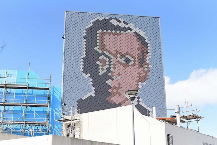
A BOLD mosaic makeover as part of external renovations at the Mount Gambier Civic Centre has prompted passionate responses from South East residents.
As the $1.3m joint refurbishment project between Mount Gambier City Council and Country Arts SA nears completion, the pixelated image of Sir Robert Helpmann on the building’s 30m fly tower has become a point of contention on social media.
Interlocking zinc panels were fixed to a steel and plywood frame to act as a waterproof skin and protect the deteriorating original cladding from further weather damage.
While many applauded the innovative design, others were critical of the execution of the concept or the new-look altogether.
A post on The Border Watch Facebook page on Tuesday received over 100 comments from both sides of the debate.
Damo Little Needed to be retiled. Retiling it in this style cost slightly more than it would have anyway. Not a waste of money, better looking than it was, can tell it’s Sir Robert Helpmann, but the black overshadow makes it look a bit crappy.
Cameron Horsburgh I really like it. It had to be done and the idea is a whole lot better than most of the suggestions I’ve seen.
Graham Jantosh It’s dark and drab, something much brighter and flamboyant would have been much better and maybe something by a local artist even … far too conservative and boring.
Chris Lloyd Clever and a talking point for visitors to our town
Lee Bartholomew Ugly, horrible and big waste of money. Have to wonder who makes these decisions.
Angela Barnes Love it. Better than a boring wall. And let’s face it, I wouldn’t know what he looked like anyway!
Jai Everlyn It is absolutely atrocious!
Victoria Leane Looks fantastic!
Meanwhile, 112 voters had responded to a poll on The Border Watch website, with 45pc voting the new-look was an “eyesore”, 29pc voted “love it”, 11pc sat on the fence and voted “it’s okay, I guess,” while 15pc voted “not my cup of tea.


